iCook
Collaborator: Chimian Wu Jie Tan Tianyuan Zhang Linjun Li

OVERVIEW
iCook is a smartphone Application providing a worry-free cooking experience to the kitchen freshmen, from choosing recipes to serving dinners. While there are many mobile cooking assistances available these days, few of them are designed for kitchen freshmen and can't really provide what they need in a cooking process. After talking to dozens of kitchen freshmen like us and an in-depth study, we designed a viable product that helps new cooks better prepare their meals.
Check the prototype (You can view all the design by scrolling and using "<" and ">" in keyboard):
PROBLEM SPACE
The story began with my friend Nicole's experience. She was excited about her first time cooking - fried chicken wings. Without any consideration, she took the pan filled with oil and put it under the faucet. When the water dropped into the pan, all of the hot oil just splattered around the room, leaving the "scars" on the wall up until now.
This reminded us of our puerile or dangerous experiences in the first time cooking. We realized that Nicole is not the only one having trouble with this, even though we are overwhelmed with cooking assistances, like smartphone applications and recipes. So we started with the people problem:

USER RESEARCH
From the initial research, we settled the format as a smartphone application, for two reasons:
• Everything gets messy when cooking, so it needed to be a handy, convenient application that can move with users.
• It should be available to display enough information clearly, since a lot of images and texts might be included.

After deciding the platform, we need to deconstructed the big problem into these two questions:

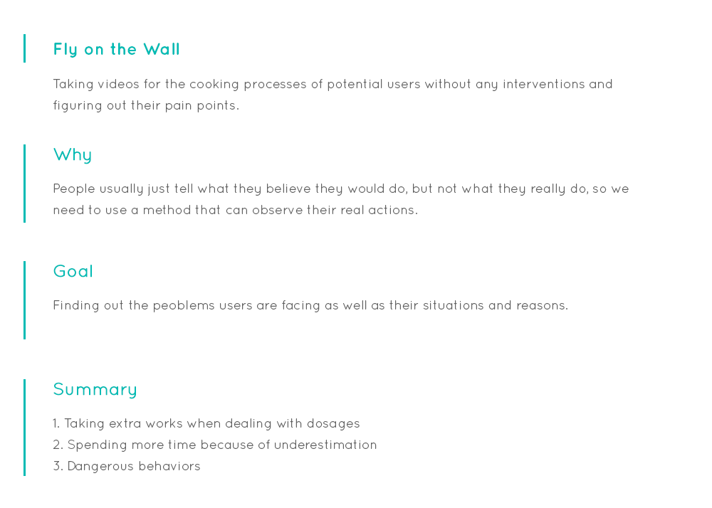
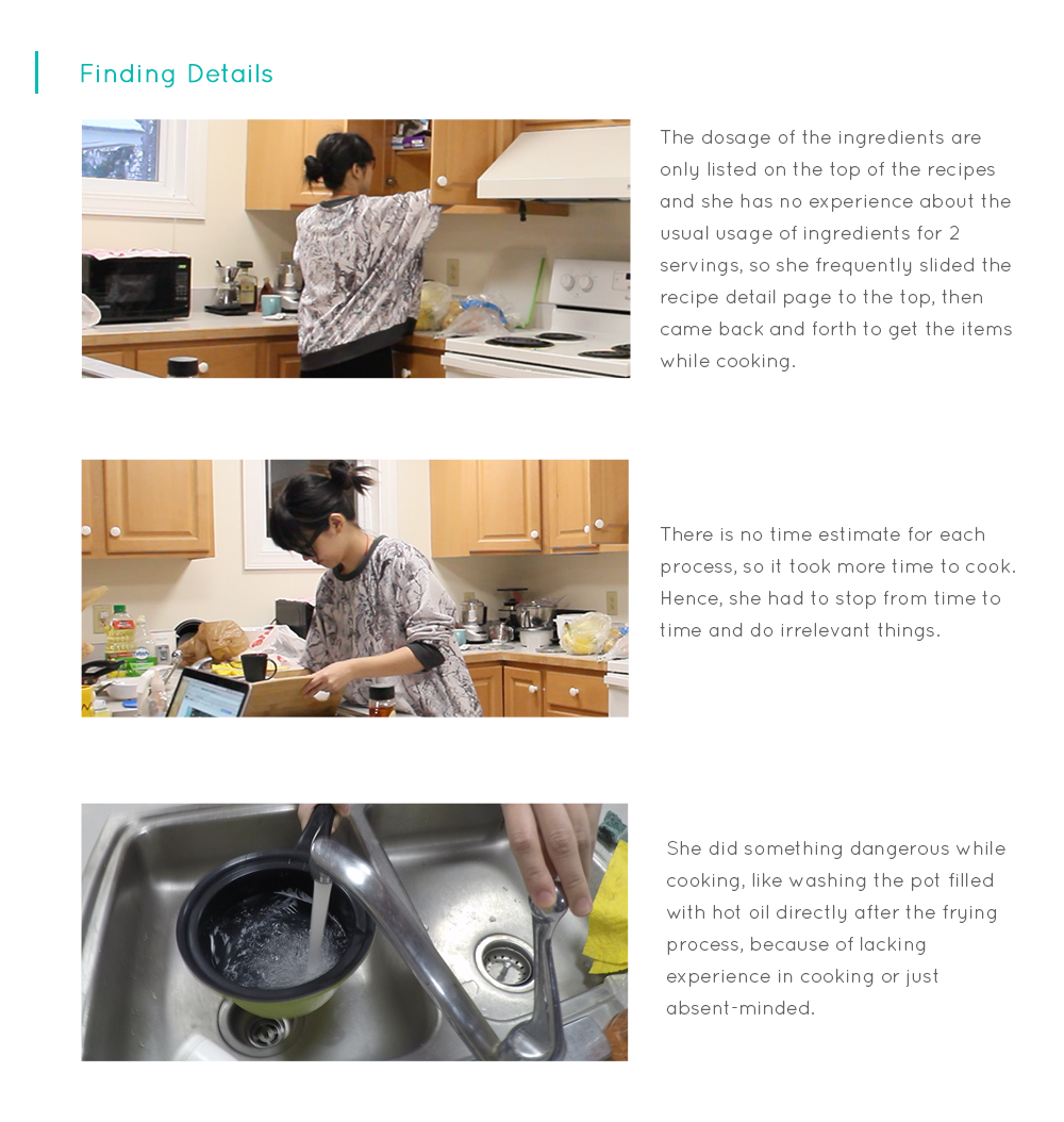
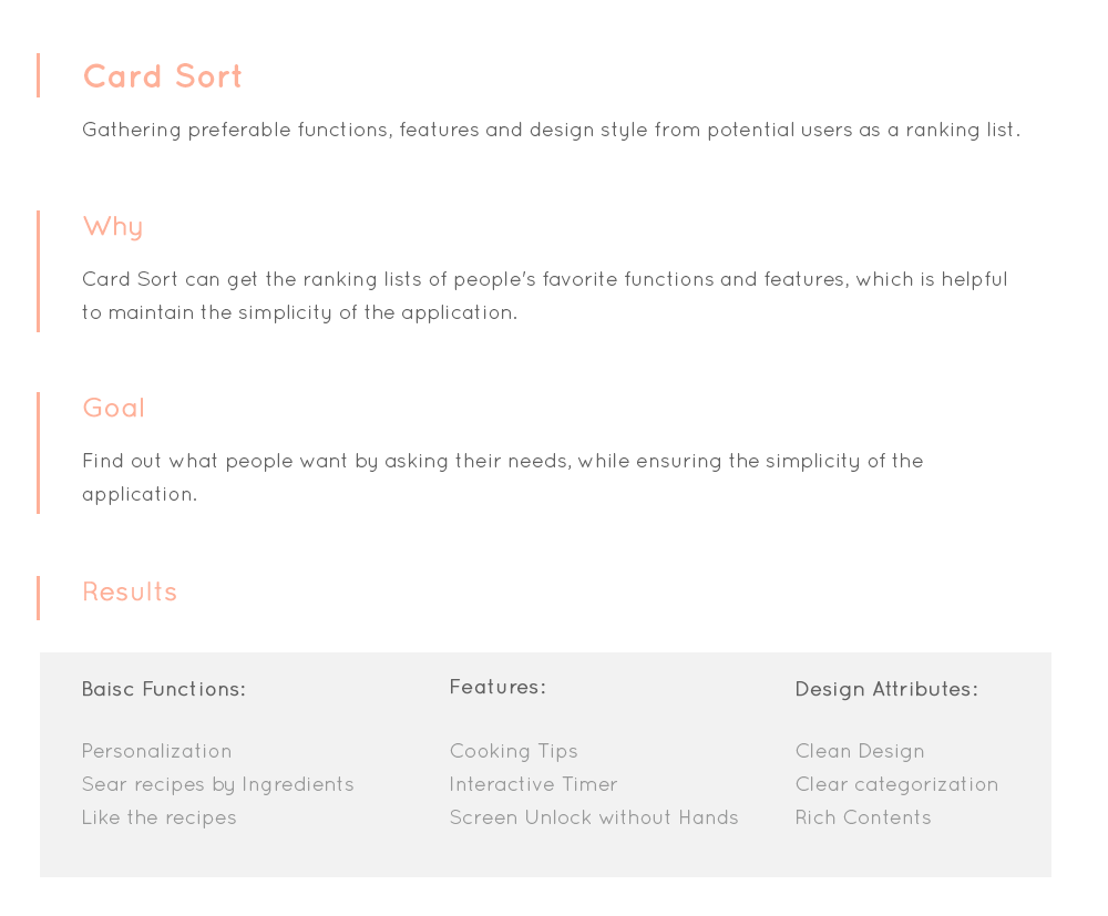
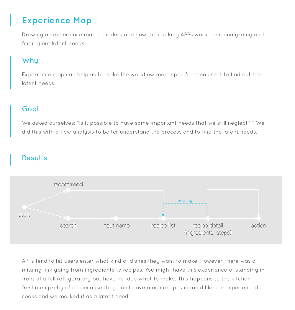
To answer these, we took a pace back to the freshman cooking experience by looking, asking and learning what they do in different contexts with mobile cooking APPs . We used the IDEO method in this process and try to collect information for different aspects. And we figured out pain points as:

• Non freshmen-friendly instructions
Current APPs just provide basic cooking instructions, since they assume the users are experienced cooks. Kitchen freshmen have to spend more time and effort to look for extra help. This is very frustrating because of the "messy hands" when you are cooking.
• Being short of personalized recipes
Imagine that you get a searching result full of meat-recipes, though you are actually a vegetarian. Things are even worse when you have allergic food as you have to filter all the recipes each time.
• Lacking recipes in mind
You will be familiar with this: you search "beef" and get dozen recipes, but when you look carefully, you find none of them actually match what you have in the refrigerator. I believe this happens to every kitchen freshman as we don't have enough recipes in mind and have to depend on the ingredients provided by the cooking APPs.
Here are the research details which led us to the findings:
PERSONA DEVELOPMENT
Based on the researches we made for our potential users, we created a persona to better guide our future processes.

IDEATION
What is the fastest way for children to learn as freshmen to everything? Teachers! So we made the first design decision: a hand-by-hand cooking trainer. Like the fitness trainer, it provides personalized training to beginners for each step of cooking process.

However, this is still a big scope. To ensure the simplicity of iCook, the next question would be: what are tasks we should focus on at the first stage? Based on the results of User Research and the categories of the affinity diagram, we narrowed our prototype onto solving these three core issues:
• Personalizing the recipes based on users' diet preferences, flavor and allergies
• Including "Searching recipes by ingredients" function to help kitchen freshmen broaden their recipe libraries
• Teaching kitchen freshmen how to cook hand-by-hand with the recipe instructions
With an affinity diagram, we grouped the needed features into three categories. Then we created a workflow to combine things together.
LO-FI PROTOTYPE
We believed that we should "go board" before "go deep". As different people will focus on different aspects of products, we started the prototyping process by figuring out as many probabilities as possible.

For the "Going Deep" process, we chose three of sketches from our huge "database" for polishing as they the core issues we will focus on.
As the "search by ingredients" feature was kind of new for users, we decided to visualize our idea on paper, then made a video to illustrate the basic process.
TESTING 1 & HI-FI PROTOTYPE
We believed that we were not lucky enough to get the "best" solution from the first version of design and it was time to see if we are at the same page. Based on the results of the user testing for the function - Searching Recipes by Ingredients (more testing details are in Appendix), we calibrated our initial design into a high fidelity workable prototype. Here are some key changes in the iteration:
Scenario - Search Recipes by Ingredients
We tried a few methods to refine the controlling problem in the user testing, and ended up with this new strategy. For example, if there are N categories for meat and D sub-categories for each meat. In most cases, D would much larger than N. It's obvious that we can just show 3 or 4 icons horizontally limited by the width of the screen, which is not sufficient. But if we put the N categories vertically, it would be more possible to reduce the chances of vertical sliding. Hence, users can just apply horizontal slicing in most cases, which will make the controls more accurate.
Scenario - Recipe Detail Presenting
For the "upgraded" instruction, we improved the recipe page by introducing some useful tools like timer and cooking tips that are designed for kitchen freshmen, to make the steps more understandable and freshman-friendly.
Scenario - Personalization Setting
As the investigation suggested, we introduced this personalization setting to collect information about users' meal preference for the recipe filtering.
TESTING 2 & FINAL DESIGN
In order to make sure we are using the right solutions, we introduced the second usability test for the whole workflow (Testing details are in the Appendix).
Typing is difficult in mobile devices, I used icons and sliding bars to provide the options. Also, people are easier to get the ideas from graphs, so this makes the process move faster. Then I kept all the selectable elements at the bottom half of screen to make the process fast as you can finish all the tasks by one hand. Here are some changes we made based on the findings:
With the feedbacks of the heuristic evaluations, I dived into the process of final design. As I try to lead users to focus on the contents themselves, I picked black, white and grey to be the main colors, then using orange to highlight important information. Here are some selected pages to show the idea.
DISCUSSION
We also introduced another user test of the prototype as an evaluation. Basically, the kitchen freshmen showed 90% positive evaluation on the small tools, like the interactive timer and the cooking tips, and none of the users had difficulty to play with the recipe detail page.
As it is a school project, we didn't have enough time and money to do sufficient user research. Fortunately, I was one of the potential users of iCook. I decided start the design with my intuition as a kitchen freshman. Then I introduced user testing to see if I was in the right page and used the results to calibrate the design.
APPENDIX
Design Process
We started our rapid iterative human-centered design process, which basically includes user research, ideation, prototyping and design evaluation.

Final Design walkthrough video
User testing 1 details
User testing 2 details
